
Microinteractions for Language Translator
Microinteractions for Language Translator
Year
June '24 - Aug '24
Project
Microinteractions
Tools
Figma, FigJam
The Client
Verbalista
Verbalista
The UX Design Team
Aleena Qaiser
Amol Mendonca
Aleena Qaiser
Amol Mendonca
Type of Work
Identifying client & user needs
Design Audit
Design Development
Wireframing & Prototyping
Identifying client & user needs
Design Audit
Design Development
Wireframing & Prototyping
At Desai Accelerator, I worked with Verbalista, a professional translator to help LATAM teams be productive in English. I improved platform usability by analyzing user flows, identifying design issues, and optimizing micro-interactions to create a more intuitive, low-friction experience.
Iterated various user flows; while the startup has since pivoted, this reflects the dynamic nature of early-stage product development.
The Challenge
The Challenge
⏳
⏳
Time-consuming to write a sentence as it typically requires multiple reviews
Time-consuming to write a sentence as it typically requires multiple reviews
Switching between multiple tools such as Google Translate, ChatGPT, and Grammarly
Switching between multiple tools such as Google Translate, ChatGPT, and Grammarly
The Current Solution
The Current Solution
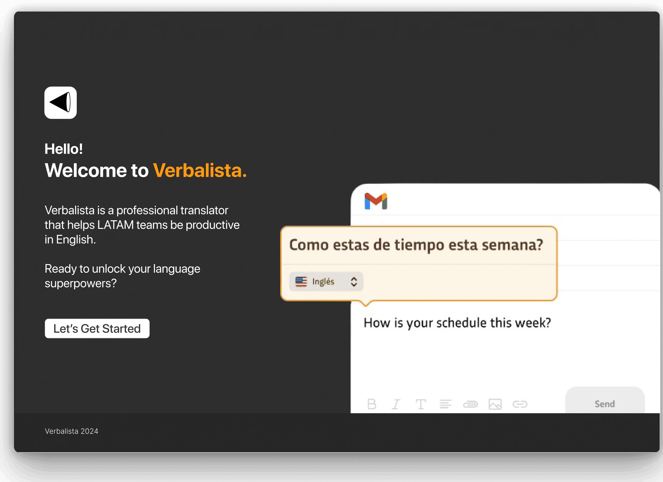
Verbalista lets users type in their native language and get instant English translations across any app. We explored alternatives to the current popover input, which felt unnatural and disorienting, aiming for a more intuitive and seamless writing experience.
Verbalista lets users type in their native language and get instant English translations across any app. We explored alternatives to the current popover input, which felt unnatural and disorienting, aiming for a more intuitive and seamless writing experience.

Target Audience
Target Audience
LATAM professionals working across English/Spanish/Portuguese.
LATAM professionals working across English/Spanish/Portuguese.
The "Write" Experience
The "Write" Experience

The writing experience was broadly categorized as:
The writing experience was broadly categorized as:

User Flow Diagrams
User Flow Diagrams
How do users initially enter and interact with Verbalista?
Amol and I analyzed Grammarly’s workflows, identified gaps, and brainstormed new flows, which we presented in a Design Sprint with feedback from Adrian Pittman, former Head of UX at Google and LinkedIn.
How do users initially enter and interact with Verbalista?
Amol and I analyzed Grammarly’s workflows, identified gaps, and brainstormed new flows, which we presented in a Design Sprint with feedback from Adrian Pittman, former Head of UX at Google and LinkedIn.
Simultaneous Translation vs. Sequential Translation

Simultaneous Translation

Sequential Translation
Simultaneous Translation
Sequential Translation
Simultaneous Translation
Sequential Translation
Simultaneous Translation
Sequential Translation
Iterations
Iterations
Simultaneous Translation
Simultaneous Translation
via Popover
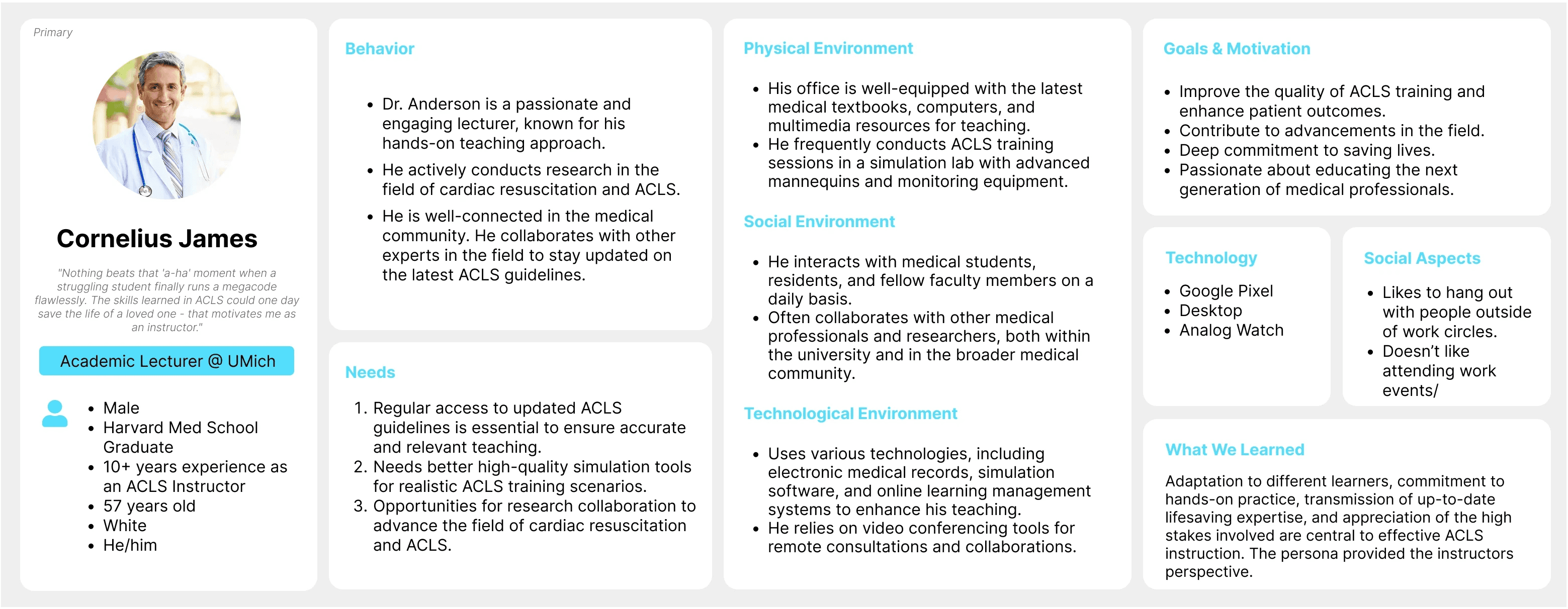
We created two primary and two secondary personas: medical students and instructors.
Creating personas helped us empathize with our users and see the problem from their perspective. It also helped us generate ideas and solutions that were tailored to their needs and goals.


via Bubble
We created two primary and two secondary personas: medical students and instructors.
Creating personas helped us empathize with our users and see the problem from their perspective. It also helped us generate ideas and solutions that were tailored to their needs and goals.
Pros
💪 Enhanced user control
⏱️ Increased efficiency
✨ Potential for text animations
Inspired by WWDC-style animations, these could enhance the experience and make it more engaging.
Cons
🚫 Typing in a pop-up feels unnatural
It creates a barrier compared to using the native text box, interrupting the flow.
🖱️ Unintuitive interaction
Clicking first to activate the pop-up before typing feels less seamless than directly typing into a native text field.
🔄 Disorientation risk
Moving the pop-up elsewhere could be disorienting, as typing in one place while the output appears in another can confuse users.
🧩 Limited scalability
Pop-ups can be awkwardly placed in constrained environments and difficult to scale for different screen sizes or layouts.
Pros
💪 Enhanced user control
Live translation as you type creates a feeling of having "language superpowers," empowering the user.
✨ Potential for text animations
Inspired by WWDC-style animations, these could enhance the experience and make it more engaging.
⏱️ Increased efficiency
Reduces time spent on translations, leading to quicker and more efficient work.
Cons
🚫 Typing in a pop-up feels unnatural:
It creates a barrier compared to using the native text box, interrupting the flow.
🖱️ Unintuitive interaction
Clicking first to activate the pop-up before typing feels less seamless than directly typing into a native text field.
🔄 Disorientation risk
Moving the pop-up elsewhere could be disorienting, as typing in one place while the output appears in another can confuse users.
🧩 Limited scalability
Pop-ups can be awkwardly placed in constrained environments and difficult to scale for different screen sizes or layouts.
Sequential Translation
Sequential Translation
Grammarly-inspired
We created two primary and two secondary personas: medical students and instructors.
Creating personas helped us empathize with our users and see the problem from their perspective. It also helped us generate ideas and solutions that were tailored to their needs and goals.
Popover upon selection
We created two primary and two secondary personas: medical students and instructors.
Creating personas helped us empathize with our users and see the problem from their perspective. It also helped us generate ideas and solutions that were tailored to their needs and goals.
Mini-menu option
We created two primary and two secondary personas: medical students and instructors.
Creating personas helped us empathize with our users and see the problem from their perspective. It also helped us generate ideas and solutions that were tailored to their needs and goals.
Pros
🖋️ Native text box experience
Typing directly into the text box feels more natural and scalable
🎮 Increased user control
Allows users to take additional actions once the phrase is fully written.
🧠 Reduced cognitive load
No live text minimizes distractions, helping users stay focused on their input.
🚂 Maintain train of thought
Delayed translation, after typing, prevents interruptions from a live feed and helps users concentrate better.
Cons
🐢 More steps involved
May take longer, as the entire message is typed before the translation is shown and possibly edited afterward.
⚠️ Potential issues with autodetection
Automatic language detection could trigger inaccurately, depending on the context of the conversation.
Pros
🖋️ Native text box experience
Typing directly into the text box feels more natural and scalable.
🎮 Increased user control
Allows users to take additional actions once the phrase is fully written.
🧠 Reduced cognitive load
No live text minimizes distractions, helping users stay focused on their input.
🚂 Maintain train of thought
Delayed translation, after typing, prevents interruptions from a live feed and helps users concentrate better.
Cons
🐢 More steps involved
May take longer, as the entire message is typed before the translation is shown and possibly edited afterward.
⚠️ Potential issues with autodetection
Automatic language detection could trigger inaccurately, depending on the context of the conversation.
Feedback from Design Sprint
Feedback from Design Sprint
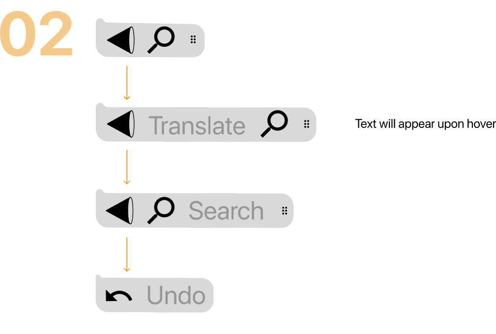
Speed is crucial
There are 3 possible ways to translate
Translate on send
Translate on pause
Translate on button press
Translate on send
Translate on pause
Translate on button press
Prioritize fewer steps
Prioritize fewer steps
Eloquent degradation
Emphasize functionality and user experience continuity across various technological environments.
Emphasize functionality and user experience continuity across various technological environments.
Emphasize functionality and user experience continuity across various technological environments.
Feedback from Users
Feedback from Users
The founders, along with the Developers Team, created a Demo version of Verbalista which they distributed to interested users. They collected the data on Google Sheets and shared it with the UX Design Team.
The founders, along with the Developers Team, created a Demo version of Verbalista which they distributed to interested users. They collected the data on Google Sheets and shared it with the UX Design Team.

Revised Designs
Revised Designs
While working within the WhatsApp Web for iOS environment, we observed that selecting text activates WhatsApp's native popover.
Our challenge was to integrate our own popover seamlessly without disrupting these native elements. The image below displays WhatsApp’s built-in popover.
While working within the WhatsApp Web for iOS environment, we observed that selecting text activates WhatsApp's native popover.
Our challenge was to integrate our own popover seamlessly without disrupting these native elements. The image below displays WhatsApp’s built-in popover.

I crafted multiple iterations of this flow, continuously refining the design based on feedback from the founders:
I crafted multiple iterations of this flow, continuously refining the design based on feedback from the founders:


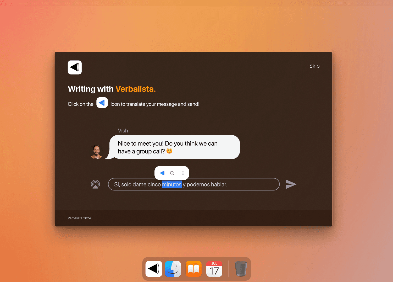
The Onboarding
The onboarding flow introduces Verbalista’s reading and writing features through an interactive, step-by-step experience that helps users feel empowered and understand its capabilities more fully.
The onboarding flow introduces Verbalista’s reading and writing features through an interactive, step-by-step experience that helps users feel empowered and understand its capabilities more fully.
Wireframes


Onboarding Flow
Follow directions to enable Verbalista
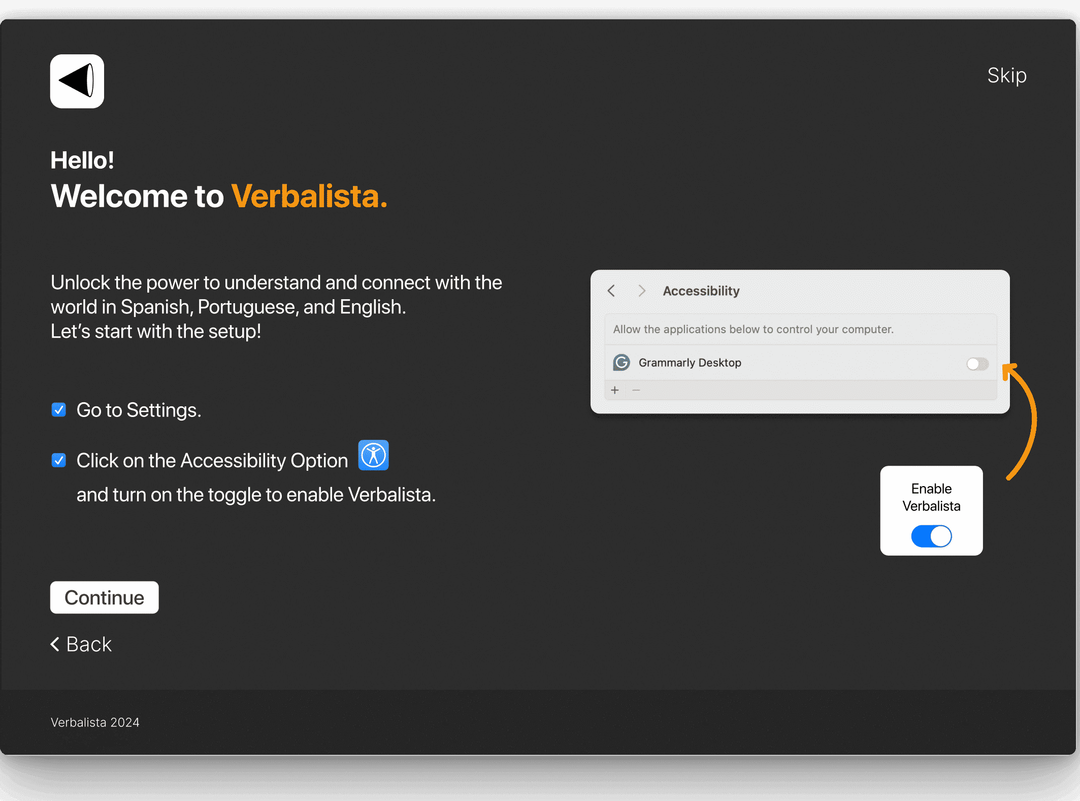
Click continue
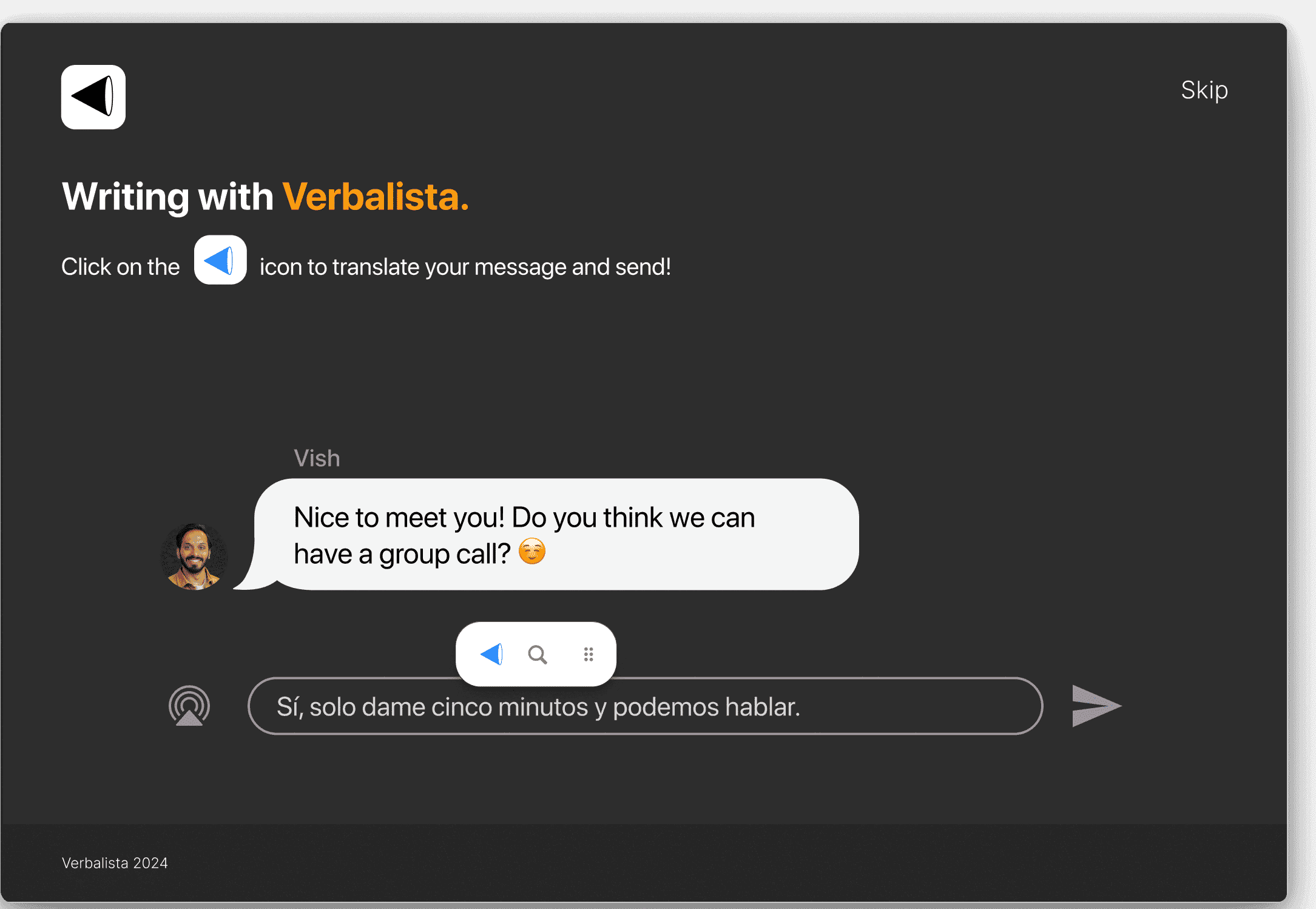
Select text and click on Verbalista's icon to translate

Click on search icon to define text

Select language
Follow directions to enable Verbalista
Click continue
Select text and click on Verbalista's icon to translate
Click on search icon to define text
Select language
Follow directions to enable Verbalista
Click continue
Select text and click on Verbalista's icon to translate
Click on search icon to define text
Select language
Follow directions to enable Verbalista
Click continue
Select text and click on Verbalista's icon to translate
Click on search icon to define text
Select language

Learning Outcomes
🌟Learned effective design presentation
The founders guided us on how to organize and present our design work like industry leaders at companies such as LinkedIn.
🎯Attention to detail
I discovered the significance of every design element, as even minor inaccuracies, such as popovers being activated incorrectly, can lead to poor user experiences.
❓The importance of inquiry
I learned to ask questions and clarify any confusion early on, which enhances understanding of the product and enables the delivery of high-quality solutions.
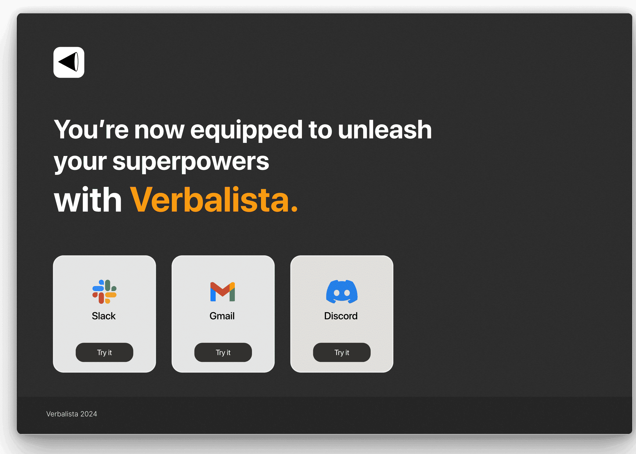
Next Project


Learning Outcomes
🌟Learned effective design presentation
The founders guided us on how to organize and present our design work like industry leaders at companies such as LinkedIn.
🎯Attention to detail
I discovered the significance of every design element, as even minor inaccuracies—such as popovers being activated incorrectly—can lead to poor user experiences. This motivated our team to swiftly address such issues.
❓The importance of inquiry
I learned to ask questions and clarify any confusion early on, which enhances understanding of the product and enables the delivery of high-quality solutions.
